Examples
Here are some examples to get you started. As you can see Protime has a quite flexible identity. As long as you use the corporate colours, the right typography and put everything on the grid, there is not much you can do wrong.
Grid
Our corporate identity is based on a grid. The grid is used on the website, in print, in presentations, … It serves two purposes: in the first place it makes sure the company is presented consistently and meanwhile it provides a flexible structure, thanks to the large amount of variations and options.
Baseline
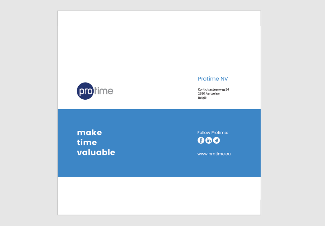
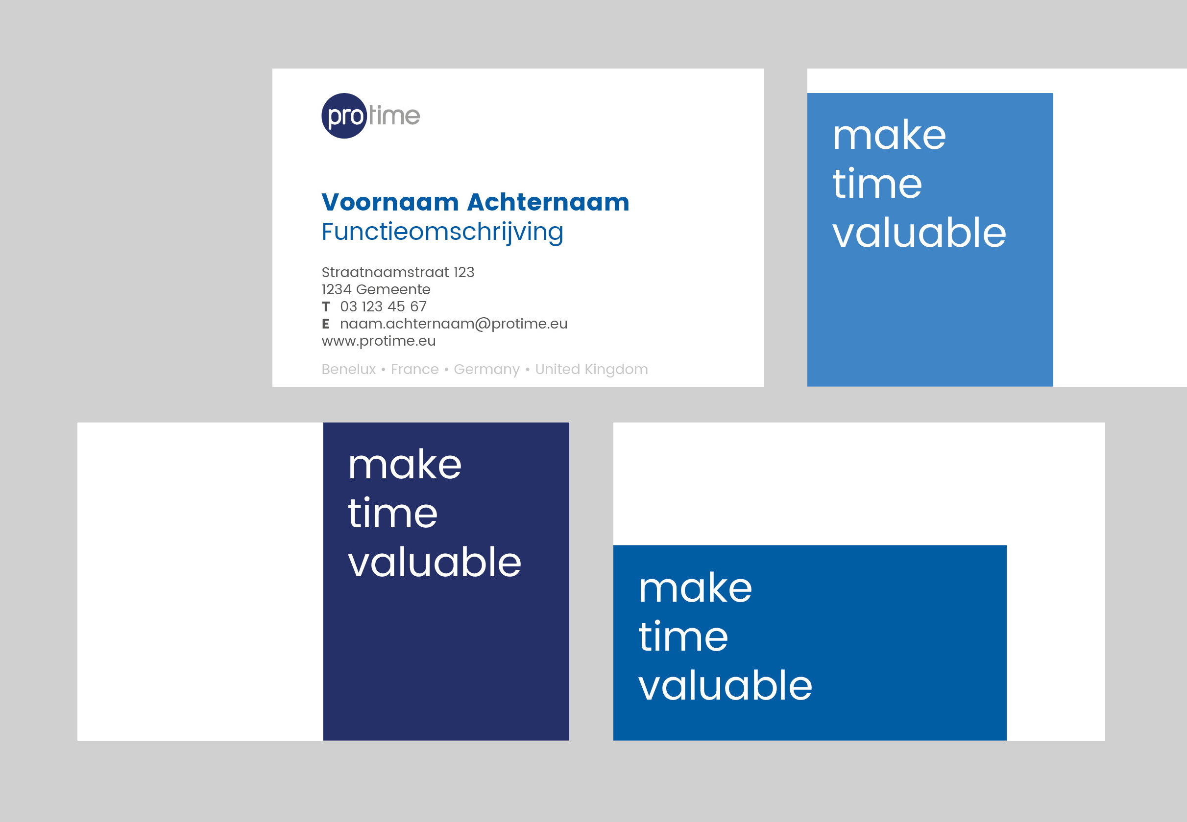
Protime's baseline is "make time valuable". The baseline can be used on the backsides of brochures, writing paper, business cards or other documents. The baseline sits in a block that fits into the grid.

Visit Cards
Flyer
This is an example of a square reference case leaflet.
P.S. for more commercial flyers an templates, please contact Marketing.
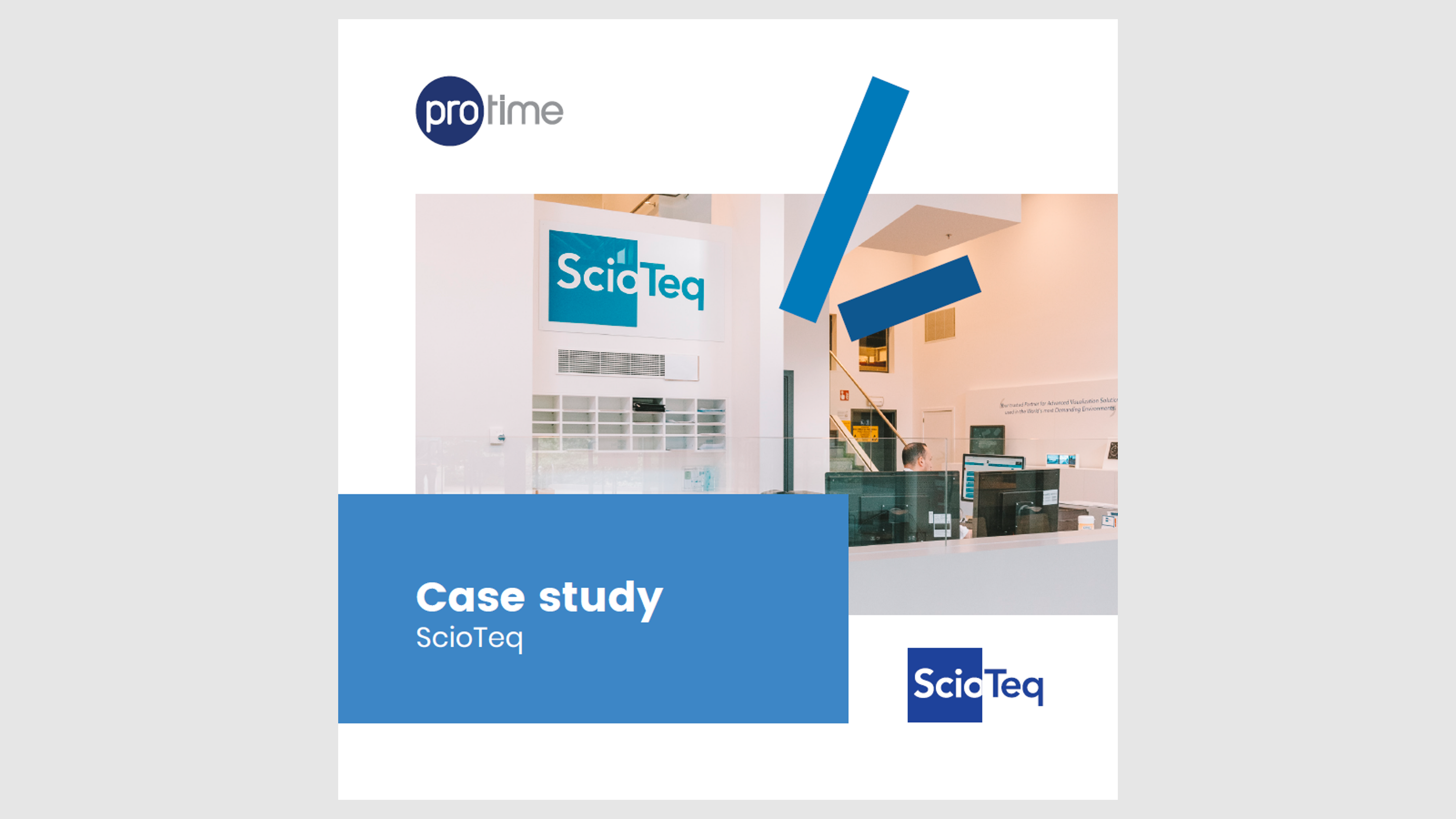
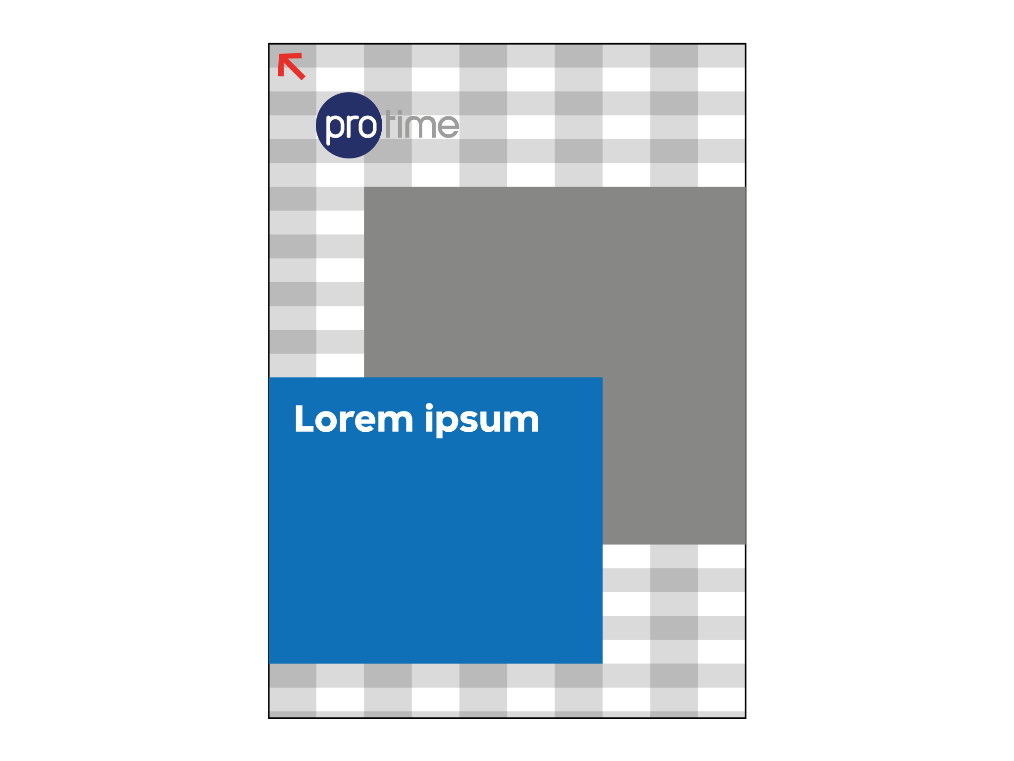
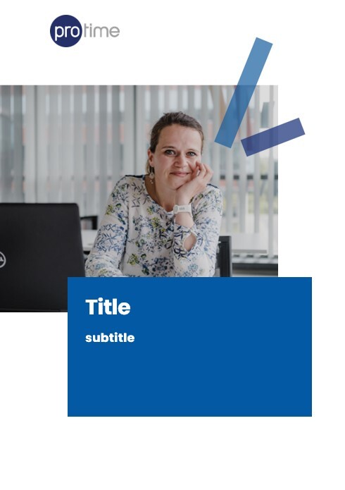
Folder or document cover
A document folder consists of 4 elements: our Protime logo, a Protime picture, a Protime spark and a Title banner.
The title banner box is always in a Protime blue color and has these fonts:
Cover Titles
Font: Poppins Bold
Size: 40 pt
Leading: 48 pt
Align: left
Cover Subtitles
Font: Poppins Bold
Size: 20 pt
Leading: 24 pt
Align: left
Document title (When there is no subtitle)
Font: Poppins Bold
Size: 60 pt
Leading: 72 pt
Align: left
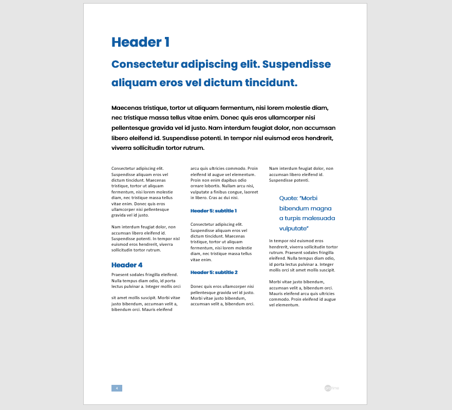
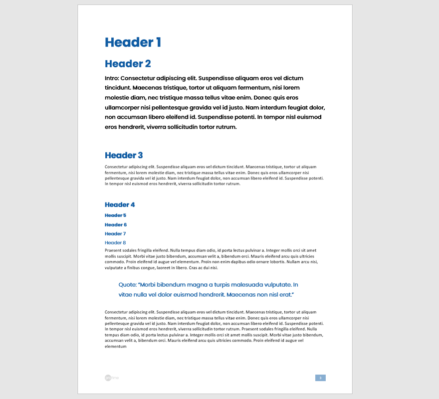
Folder or document content
The document content is easily used by downloading the Protime Word Template.
Folder or document Back