Fonts
Protime uses two fonts: the sans serif fonts Poppins and Calibri. Both fonts are free.
The basics
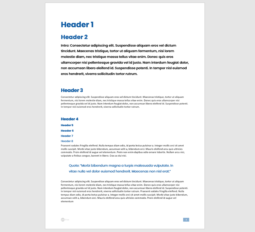
Protime uses two fonts: the sans serif fonts Poppins and Calibri. Use Calibri for long body copy. Use Poppins for all other text, like headings, streamers and quotes. Always align your texts to the left and never justify. We'll give some specific instructions for documents ≤ 297 mm width below.
Calibri comes with every Microsoft Office install. To use Poppins, you have to download the free font from the Google Fonts website.

Typography in print documents ≤ 297 mm width
Cover Titles
Font: Poppins Bold
Size: 40 pt
Leading: 48 pt
Align: left
Cover Subtitles
Font: Poppins Bold
Size: 20 pt
Leading: 24 pt
Align: left
Document title
Font: Poppins Bold
Size: 60 pt
Leading: 72 pt
Align: left
Subheader 1
Font: Poppins Bold
Size: 30 pt
Leading: 36 pt
Align: left
Subheader 2
Font: Poppins Bold
Size: 20 pt
Leading: 24 pt
Align: left
Subheader 3
Font: Poppins Bold
Size: 10 pt
Leading: 12 pt
Align: left
Intro
Font: Poppins Regular
Size: 14 pt
Leading: 18 pt
Align: left
Streamers and quotes
Font: Poppins Regular
Size: 20 pt
Leading: 24 pt
Align: left
Body text
Font: Calibri
Size: 10 pt
Leading: 12 pt
Align: left

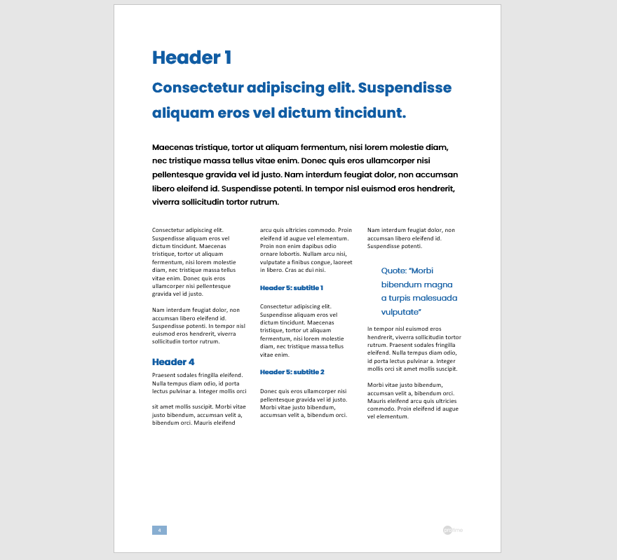
Grid and columns
The leading is always 1.2 times the font size. All text is set on a baseline grid of 12 pt (with the intro as an exception, which is based on a 18 pt grid). For documents or presentations, you can use the full width available after setting the document margins based on the grid. For marketing documents like brochures and leaflets, we recommend using two or three columns. The white space between columns is 1/4 of the document grid.
Word and Powerpoint
For Word and Powerpoint templates to get you started, have a look at the Templates section.